导入matplotlib
import matplotlib.pyplot as plt
import matplotlib as mplMatplotlib是Python的绘图库,其中的pyplot包封装了很多画图的函数。Matplotlib.pyplot包含一系列类似 MATLAB 中绘图函数的相关函数每个pyplot函数对一幅图片(figure)做一些改动:比如创建新图片,在图片创建一个新的作图区域(plotting area),在一个作图区域内画直线,给图添加标签(label)等。matplotlib.pyplot是有状态的,亦即它会保存当前图片和作图区域的状态,新的作图函数会作用在当前图片的状态基础之上。
打开/关闭交互模式
plt.ion()
plt.ioff()
matplotlib的显示模式默认为阻塞(block)模式,打开交互模式后,执行plt.show()程序会接着往下执行,可以显示多个窗口。但在show()之前一定要使用plt.ioff(),否则图片会一闪而过。在交互模式下,plt.plot(x)或plt.imshow(x)是直接出图像,不需要plt.show()
定义画布
plt.figure(num=None, figsize=None, dpi=None, facecolor=None, edgecolor=None, frameon=True)num:图像编号或名称,数字为编号 ,字符串为名称
figsize:指定figure的宽和高,单位为英寸;
dpi参数指定绘图对象的分辨率,即每英寸多少个像素,缺省值为80
1英寸等于2.5cm,A4纸是 21*30cm的纸张
facecolor:背景颜色
edgecolor:边框颜色
frameon:是否显示边框
画图并显示
import matplotlib.pyplot as plt
import numpy as np
pic=plt.figure('ex_1',figsize=(16,9),dpi=480,facecolor='red',edgecolor='blue')
x = np.linspace(-10, 10, 500)
y1=x*x
y2=2*x+1
plt.plot(x,y1)
plt.plot(x,y2)
plt.savefig('ex_1.png')
plt.show()plt.plot(自变量,因变量,color=’r’,label=’str’,linestyle=’-‘)将图表示出来,plt.savefig(‘文件名’)在plt.show()之前,否则保存的图是空白,plt.show()显示出来。在python代码的最后写plt.show()可以使前面绘制的图全部显示出来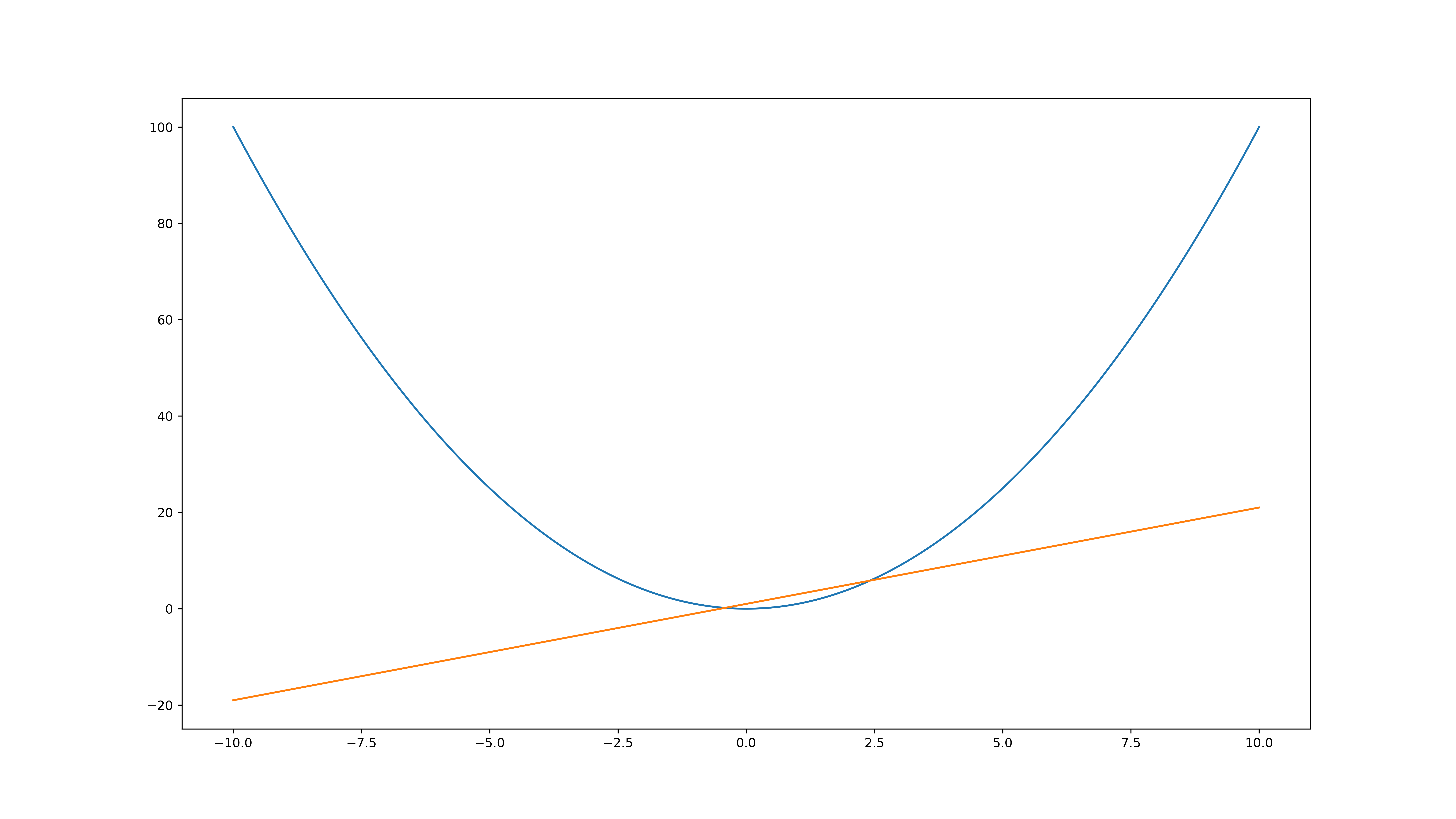
plt.plot(x, y2, color = 'black', linewidth = 2.0, linestyle = '--')可将y2改成虚线
绘制子图
plt.subplots(nrows=1, ncols=1, sharex=False, sharey=False, squeeze=True,
         subplot_kw=None, gridspec_kw=None, **fig_kw):
参数:
Parameters
----------
nrows, ncols : int, optional, default: 1
    子图网格的行列数.

sharex, sharey : bool or {'none', 'all', 'row', 'col'}, default: False
    Controls sharing of properties among x (`sharex`) or y (`sharey`)
    axes:

    - True or 'all': x- or y-axis will be shared among all subplots.
    - False or 'none': each subplot x- or y-axis will be independent.
    - 'row': each subplot row will share an x- or y-axis.
    - 'col': each subplot column will share an x- or y-axis.

    When subplots have a shared x-axis along a column, only the x tick
    labels of the bottom subplot are created. Similarly, when subplots
    have a shared y-axis along a row, only the y tick labels of the first
    column subplot are created. To later turn other subplots' ticklabels
    on, use `~matplotlib.axes.Axes.tick_params`.

squeeze : bool, optional, default: True
    - If True, extra dimensions are squeezed out from the returned
      array of `~matplotlib.axes.Axes`:

      - if only one subplot is constructed (nrows=ncols=1), the
        resulting single Axes object is returned as a scalar.
      - for Nx1 or 1xM subplots, the returned object is a 1D numpy
        object array of Axes objects.
      - for NxM, subplots with N>1 and M>1 are returned as a 2D array.

    - If False, no squeezing at all is done: the returned Axes object is
      always a 2D array containing Axes instances, even if it ends up
      being 1x1.

num : int or str, optional, default: None
    A `.pyplot.figure` keyword that sets the figure number or label.

subplot_kw : dict, optional
    Dict with keywords passed to the
    `~matplotlib.figure.Figure.add_subplot` call used to create each
    subplot.

gridspec_kw : dict, optional
    Dict with keywords passed to the `~matplotlib.gridspec.GridSpec`
    constructor used to create the grid the subplots are placed on.

**fig_kw
    All additional keyword arguments are passed to the
    `.pyplot.figure` call.
返回:
参数1:figure
参数2:axes对象
fig, (ax1, ax2) = plt.subplot(1, 2)
fig, ((ax1, ax2), (ax3, ax4)) = plt.subplot(2, 2)
示例1(定义子图然后通过返回的axes操作):
import numpy as np
import matplotlib.pyplot as plt
x = np.linspace(-10, 10, 500)
#划分子图
fig,axes=plt.subplots(2,2,sharex='row')
ax1=axes[0,0]
ax2=axes[0,1]
ax3=axes[1,0]
ax4=axes[1,1]
#作图1
ax1.plot(x, x)
#作图2
ax2.plot(x, -x)
#作图3
ax3.plot(x, x ** 2)
ax3.grid(color='r', linestyle='--', linewidth=1,alpha=0.3)
#作图4
ax4.plot(x, np.log(np.abs(x)))
plt.show()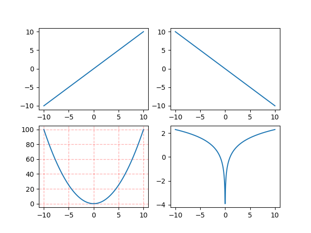
示例2(定义画布再添加子图):
import matplotlib.pyplot as plt
import numpy as np
fig=plt.figure()
x=np.linspace(-10, 10, 500)
ax1=fig.add_subplot(3,3,1)
ax1.plot(x, x*x)
ax2=fig.add_subplot(3,3,3)
ax2.plot(x,np.sin(x))
ax3=fig.add_subplot(3,3,5)
ax3.plot(x,np.arctan(x))
ax4=fig.add_subplot(3,3,9)
ax4.plot(x,np.cos(x))
plt.savefig('object_figure')
plt.show() 
示例3(子图嵌套)
import numpy as np
import matplotlib.pyplot as plt
#新建figure
fig = plt.figure()
# 定义数据
x = np.linspace(-10,10,500)
y=2*x*2*x
z =2*x
#新建区域ax1
#figure的百分比,从figure 10%的位置开始绘制, 宽高是figure的80%
left, bottom, width, height = 0.1, 0.1, 0.8, 0.8
# 获得绘制的句柄
ax1 = fig.add_axes([left, bottom, width, height])
ax1.plot(x, y, 'r')
ax1.set_title('4x^2')
#新增区域ax2,嵌套在ax1内
left, bottom, width, height = 0.35 ,0.6, 0.25, 0.25
# 获得绘制的句柄
ax2 = fig.add_axes([left, bottom, width, height])
ax2.plot(x,z, 'b')
ax2.set_title('2x')
plt.show()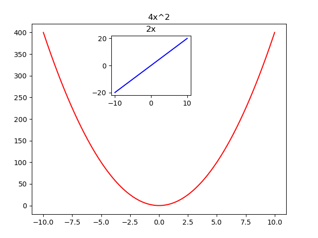
读写图片
plt.imread('文件名')
plt.imsave('文件名')
plt.imshow()与plt.show()
plt.imshow()函数负责对图像进行处理,并显示其格式,而plt.show()则是将plt.imshow()处理后的函数显示出来。在plt.scatter()前加入plt.imshow(‘img’)可对img的图描上散点。
plt.imshow(image) image可以是二维像素数组
visdata=vis_dataset(dis_arr,20,20)
#print_arr(visdata)
plt.imshow(visdata)
plt.show() 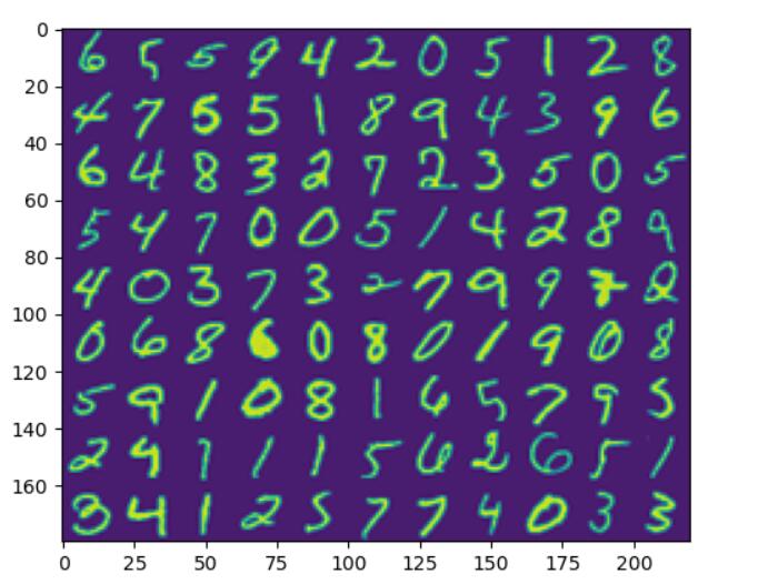
画散点图、等高线图和3d图
散点图
matplotlib.pyplot.scatter(x, y, s=None, c=None, marker=None, cmap=None, norm=None, vmin=None, vmax=None, alpha=None, linewidths=None, verts=None, edgecolors=None, *, data=None, **kwargs)x,y:表示的是大小为(n,)的数组,也就是我们即将绘制散点图的数据点
s:是一个实数或者是一个数组大小为(n,),这个是一个可选的参数。
c:表示的是颜色,也是一个可选项。默认是蓝色’b’,表示的是标记的颜色,或者可以是一个表示颜色的字符,或者是一个长度为n的表示颜色的序列等等,感觉还没用到过现在不解释了。但是c不可以是一个单独的RGB数字,也不可以是一个RGBA的序列。可以是他们的2维数组(只有一行)。
marker:表示的是标记的样式,默认的是’o’。
cmap:Colormap实体或者是一个colormap的名字,cmap仅仅当c是一个浮点数数组的时候才使用。如果没有申明就是image.cmap
norm:Normalize实体来将数据亮度转化到0-1之间,也是只有c是一个浮点数的数组的时候才使用。如果没有申明,就是默认为colors.Normalize。
vmin,vmax:实数,当norm存在的时候忽略。用来进行亮度数据的归一化。
alpha:实数,0-1之间。
linewidths:也就是标记点的长度。
pic=plt.figure('scatter and regression')
plt.scatter(X[:,1],y)
plt.plot(X[:,1],np.dot(X,theta),color='red')
plt.xlabel('X')
plt.ylabel('y')
plt.show()
使用scatter函数,效果如图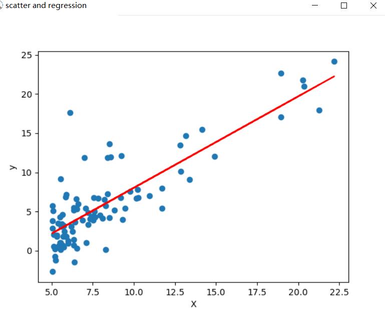
等高线图
plt.contourf(x,y,f(x,y)),其中x,y是np.meshgrid的返回值,代表网格的坐标,f函数为求他们的高,x,y,f都是同维度的
n=100
theta0 = np.linspace(-10, 10, n)
theta1 = np.linspace(-1, 4, n)
# 把x,y数据生成mesh网格状的数据,因为等高线的显示是在网格的基础上添加上高度值
T0, T1 = np.meshgrid(theta0, theta1)#T0,T1都是1000x1000
# # 填充等高线
# plt.contourf(T0, T1, f(T0,T1), 40)
# 添加等高线
C = plt.contour(T0, T1, self.f(T0,T1), 40)
plt.clabel(C, inline=True, fontsize=12)
# 显示图表
plt.show()
效果如图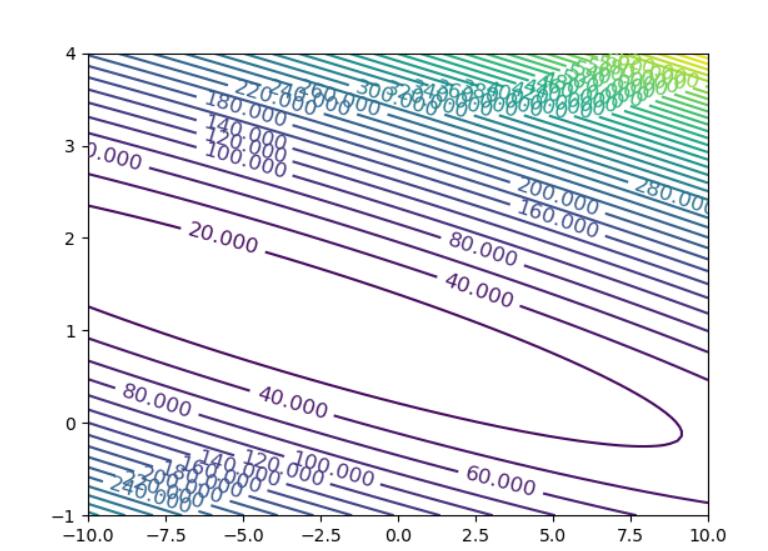
3d图
n=500
theta0 = np.linspace(-10, 10, n)
theta1 = np.linspace(-4, 4, n)
# 把x,y数据生成mesh网格状的数据,因为等高线的显示是在网格的基础上添加上高度值
T0, T1 = np.meshgrid(theta0, theta1)#T0,T1都是1000x1000
loss= self.f(T0,T1)
fig4 = plt.figure()
ax4 = plt.axes(projection='3d')
# 作图offset用来调投影平面的位置
ax4.plot_surface(T0, T1, loss, alpha=0.3, cmap='winter')  # 生成表面, alpha 用于控制透明度
ax4.contour(T0, T1, loss, zdir='z', offset=0, cmap="cool")  # 生成z方向投影,投到x-y平面
ax4.contour(T0, T1, loss, zdir='x', offset=-20, cmap="rainbow")  # 生成x方向投影,投到y-z平面
ax4.contour(T0, T1, loss, zdir='y', offset=6, cmap="rainbow")  # 生成y方向投影,投到x-z平面
# 设定显示范围
ax4.set_xlabel('theta0')
ax4.set_xlim(-20, 20)  # 拉开坐标轴范围显示投影
ax4.set_ylabel('theta1')
ax4.set_ylim(-6, 6)
ax4.set_zlabel('loss')
ax4.set_zlim(0, 400)
plt.show()
效果如图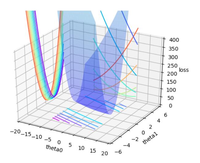
本博客所有文章除特别声明外,均采用 CC BY-SA 3.0协议 。转载请注明出处!